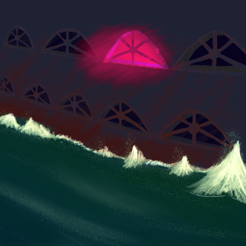
i know, but like, no, really, i mean it. check this out:

i'm learning some new skills and improving at old ones. this story occupies my head every day. i want to finish it.
making webcomics is hard. updates will resume, eventually. i have plans for this thing.
i know, but like, no, really, i mean it. check this out:

i'm learning some new skills and improving at old ones. this story occupies my head every day. i want to finish it.
also, here's a song about something we haven't seen yet (click the image):
 i have a lot of music stored up for this thing, too. once the time is right it'd be fun to release soundtrack albums.
finally, i wanted to show some art my friend apricot made of our newest characters.


i'm very grateful to have friends who like the things i make. thank you.
see you soon.
these ones took a while! had a bit of life stuff happening lately. also, these are the densest pages so far, text-wise! nice to be getting some ~worldbuilding~ out there.
i'm still experimenting with a lot of different shading and light styles in these panels. i'm sure i will settle on something eventually :)
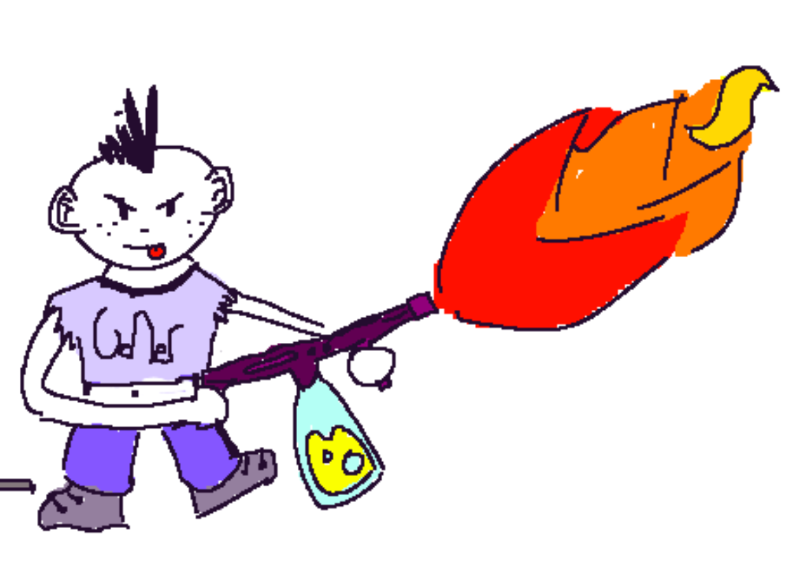
did a little drawpile with some friends the other night, and accidentally drew roly in a crop top, which amused me so much i made last minute changes to several panels to include that. also, we know some characters names, finally! i hope you like bea and roly. below is a (extremely non-canon) doodle of roly about to light shit up. enjoy.
 inspirations / distractions:
hi! i'm starting a little blog for FRACTURE, because i'm learning to do this comic stuff as i go, and i have some things i'd like to talk about. i'll make new posts here whenever i update and have something to say about the new pages.
so, learning stuff from the first scene, i made some changes to the format and how i'm approaching drawing. i switched from 600x600 to 800x800 for the panel size, as i'm planning to do some denser dialogue in this scene, and it gives me more space to work with. also, i switched from a very loud two-color palette to this simpler one, black and white with two tones of an accent color. the lighter green lets me do some subtler lighting and environment details that don't need to stand out as much.
i'm happy i get to introduce some more visually interesting characters this scene. a friend pointed out to me that she liked how i used cutaways, and while i'm happy with these kinds of pages, i would like to draw in the focus a little tighter and do some character stuff, just to make it a little easier to follow what's going on.
this update took me the longest to make of any since i started. i spent some time on designing the characters and the city environment, which i think will help me out with the rest of the scene when doing composition and details. for the city layout, i'm taking some inspiration from some cool maps of kowloon walled city.
i'm excited to get to this scene. there are a couple of parts in here that are directly adapted from earlier drafts of this story i made many years ago, and it's nice to draw them again. thank you for reading this, and for reading FRACTURE, too. i hope you like it.
inspirations / distractions: